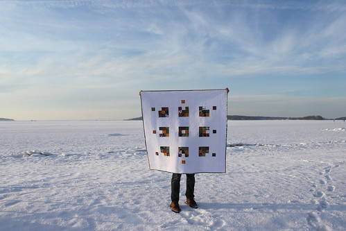
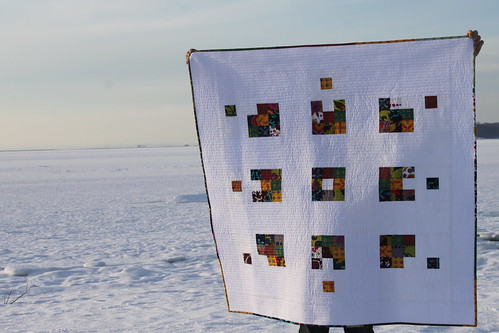
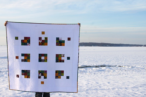
Over the weekend, I finished a quilt that had been in my WIP pile for quite some time. I had the idea for a simple nine-patch where one of the squares was removed from the group, and wanted to see how it would look when there were a few of them together. I think it’s a happy little quilt, made with Alison Glass’ Field Day collection. It’s funny, because when I look at the quilt, I see the lone-squares moving away from the nine-patch. But some people have told me that they see the square moving toward the group. I’m sure there is some kind of psychological analysis to be done here. . . but far be it for me to interpret!
I’m not entirely sure that the concept works. I think it might have had a greater impact (more movement) if the removed squares were more randomized, and if there were more nine-patches in the quilt overall. But, it was really quick to create, and an idea I may revisit down the line. For now, I have bigger regrets.
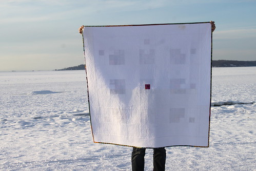
See my perfectly pieced back? I scorched it. I’m not even sure how! I was pressing the binding down quickly and my iron was obviously too hot, or possibly had some residue on it, and it left a light brown mark at the top of the quilt. I’m going to carefully try to spot-treat it with a few suggestions that I gathered from the experts at my LQS, and I’ll let you know how it turns out.
Otherwise, the top will have to become the bottom of the quilt and I will be making a label to go over the mark! I guess that is one of the beauties of a symmetrical layout!
Wish me luck, and if you have any advice to offer (or just a story to commiserate), I’d love to hear in the comments!
Linking up to Sew Cute Tuesday at Blossom Heart Quilts.
15 Comments
Comments are closed.

It’s amazing! I love both the concept and the execution. I can totally see this quilt in these colors hanging on my wall at home. And the back is gorgeous too. The scorch mark just adds a hint of humanity and lets the handler know you’re not perfect ;)
I like this quilt – very cool effect. So sorry that you scorched it – very frustrating when you are just finishing something up. At least it’s on the back!!
I really like the concept behind this quilt and the execution is fantastic. I am really impressed with how well the single square on the back of the quilt aligns with the design on the front. The fabric choices are lovely. I am so sorry about the scorch marks- that is so hard to deal with when you have such a clean aesthetic. If something goes awry on a project with more detail, I would probably suggest appliquéing or embroidering over the effected area.
I love it! What a great idea for a quilt! Beautifully executed!
I have had limited success removing scorchmarks by lightly a braiding the area then using Oxyclean. Works best when it’s removing burnt residue. If the fibers are scorched, well…umm., ouch.
I also see an “exploding” version of the pattern, so throw me into the analysis group. ;) Bummer about the iron turning the backing brown. I hope one of the techniques works to help remove it!
You need more psychological analysis, I do not see exploding neither squares moving away. But I do know I love your design. Amazing!!!! Congrats with your finish.
Love it! I think the sqaures away from the blocks is perfect! I hope you find a solution to the scorching issue! Nothing more frustrating than having residue on my iron and it gets on my quilt! The back is amazing too! Well done!
What an awesome design – I didn’t see the squares coming or going, but more in balance? It is neat how we each experience designs differently depending on where we are coming from. No wisdom on the scorching – if I was going to hang it on the wall, I might use a little bit a white gesso or paint to mask the mark just so I wouldn’t have to notice it all the time!
I’m in love with this quilt!
This is so graphic and bold. I absolutely love it. I see the blocks going both ways – does that mean my heads screwed on incorrectly? :D
What a bummer about the back getting scorched – hopefully everyone will be too busy thinking about the front and whether the blocks are innies or outties to take much notice. My daughter tends to turn all her drawing errors into butterflies – do you think that’ll work here :)?
You know, I can’t help seeing a flower in this as well, when the blocks are viewed as a whole. It reminds me of a flower sending off pollen into the wind. What on earth would a psych say about that??
This quilt just makes me happy. It has reminded me how much I like negative space and visually simple quilts — they can be much more striking that fussy ones. Yay for your finish!
I love this quilt so much! I love the balance…it kind of catches you by surprise when you very first look at it! And the little block on the back is truly a delight!!! Well done!!!!
What a fantastic idea for a quilt! I see the squares moving away too. I wouldn’t sweat too much about the back, that’s what makes it handmade :)
-Soma
I love the quilt, and to me it looks like those little critters are running away from home. But, maybe it was too cold at home, and they were looking for warmth! They’ll never find it there on the tundra where you took the pics….lol. Just tell people that the design was so hot that it scorched itself as you were finishing it up. Sort of like spontaneous combustion! No one will ever know the difference…8-). I mean, it’s not a love as strong as I have for the orange quilt, but I wouldn’t throw it off my bed.
Keep up the good work.
xo Linda