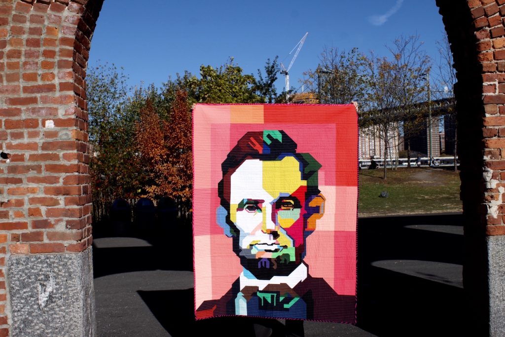
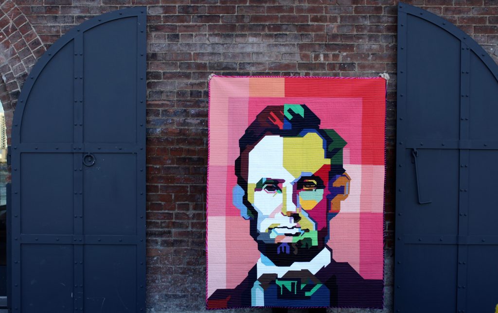
And now that the quilt is completed, it is time for me to share the story of how Lincoln came to be, from beginning to end.
In June 2015, I became intrigued by the difference between what makes a quilt “art” vs. simply a quilt for utilitarian purposes. In some ways it was easy to distinguish: art quilts are often made for hanging on walls, have decorative embellishment, and are not meant to be thrown in the washing machine and dryer to achieve the “crinkle effect”. But what about when the distinction is not so clear? What would qualify a quilt to be eligible for both? This was the place from which I came, when the project began to unfold itself to me.
I started to formulate this idea of making a quilt that had a distinct recognizable image (art), AND was completely pieced/completely functional (utility). At the same time, I had discovered and fallen in love with an Indonesian style of pop-art called WPAP. Known formally as Wedha’s Pop Art Portraits, these brightly colored vector-drawn images were the perfect inspiration for my project.
I came across an iconic image of Abraham Lincoln recreated by the incredibly talented WPAP artist Ihsan Ekaputra. The image was crisp and beautiful. The colors were vibrant and exciting. And the subject was someone worthy of dedicating the time and effort that I envisioned a project of this type taking. At the same time, I had no idea what I was doing. Using a grid to simulate blocks and settling on 6 inch block sizes, I drew a grid on the image’s face and set out inch-by-inch to recreate it using improv-piecing. I did not use a template, appliqué, tracing, paper-piecing or a light projector. I simply focused on making one block at a time. I started with the right eye. The process was painstaking. And exciting!
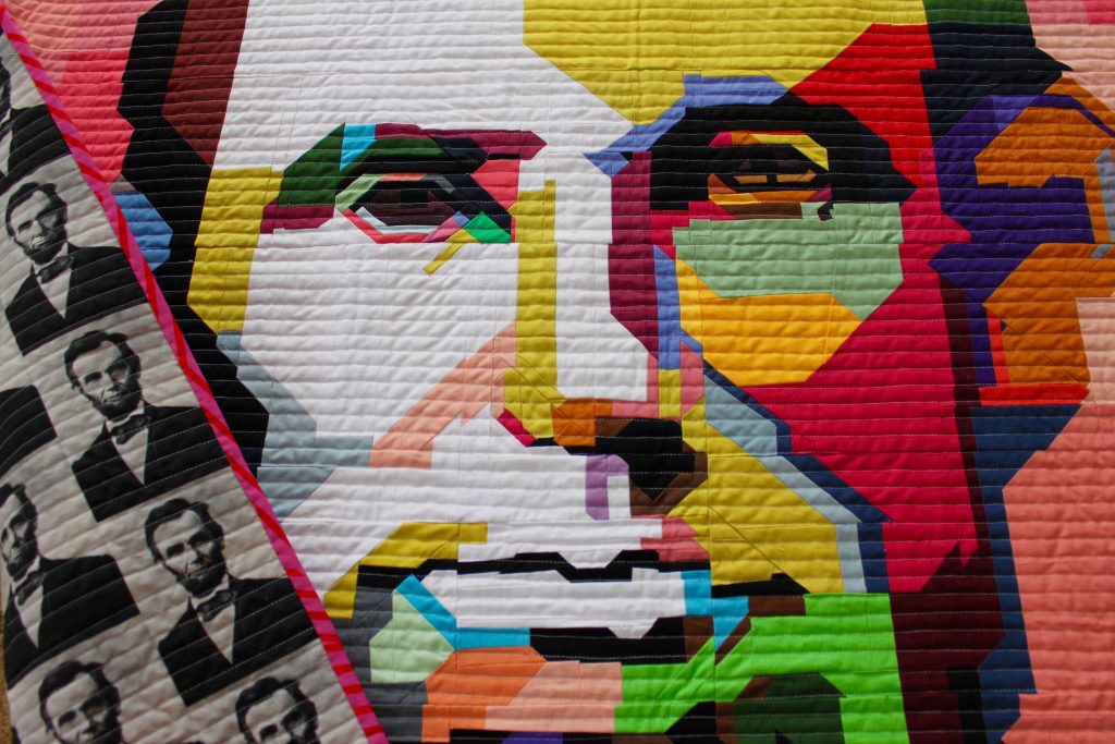
“Improv With Intent” is a term that I have been seeing more frequently on social media lately. Like improv itself, it doesn’t have one strict meaning or interpretation. For me, it meant using improv-piecing to recreate the shapes that I saw on the page. I wasn’t measuring or trying to be exact. I wasn’t even trying to make each block match up to the block next to it. I wasn’t accounting for seam allowance, and as a result, when you look closely, the pieces do not always meet. Sometimes they do. I had to rely on my instinct and my eye to do what I thought I saw, and just do my best.
Because I was aiming to recreate this specific image by Ihsan Ekaputra, I did not stray from his color choices. The unique use of pinks, greens and oranges in unexpected ways have taught me to think differently — and not be afraid of — color. Prior to making this project, I don’t think I would have thought of shadow and light in terms of COLOR. But the year-long exposure to this art has gotten into my brain! I love unexpected color combinations and now keep a shelf in my sewing room with scraps of unusual combinations that make me happy.
I ambitiously hoped that I would have the project finished by the end of the summer. At the start of 2016, this was how far I had come. Even so, just from that simple Instagram post, people were responding to the work. And they could already recognize the image! Which was both amazing and terrifying at the same time. Because now I had the weight of expectation tugging at me; and by April, I had completely stopped working on it again.
But with the support of the amazing sewing community, you guys pushed me to get over my fear and keep going. So I did. And it was hard, and I felt like I had no idea what I was doing (or sometimes even why!), but I kept going. Sometimes I would stop and work on something easy. Sometimes I would just sew pieces of scraps together in order to make myself feel productive. But I kept going. And it wasn’t, nor was it ever meant to be, perfect. It just had to be recognizable.
In October 2016, I finally finished the completed top and got right to work on straight-line quilting. I found the perfect fabric for the back, which is actually a black and white repeating image of the original portrait of Lincoln on which Ihsan Ekaputra’s image was based. Full circle.
The binding for the quilt is a combination of two striped prints from Victoria Findlay Wolfe’s Mostly Manor collection. The stripes are not uniform, but jut off in various angles — a nod to the vector-based art on which the entire quilt is based.
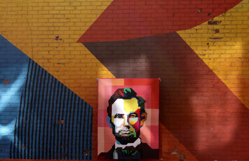
The final result is, in my opinion, usable art. And while I don’t think I’m quite ready to let my kids snuggle under it while they are eating a snack, it is very much an option. Well, at least it will be some day. Right now, Lincoln is headed off to QuiltCon, and I am excited to say that my family has made it possible for me to join him in Savannah in February! I’ve never gone before (to Savannah or to QuiltCon, actually!), so I’m thrilled to get the chance.
But that’s still not where the story ends! One of the most exciting parts of this entire process was the opportunity to reach out to the original artist, Ihsan Ekaputra, to share my version of his work with him — and to seek his permission to show this quilt at Savannah and wherever else may be. And he said yes! It took three tries before I got the right email address. So to anyone that is seeking permission to share derivative work, I say, “be persistent!” He was so gracious to share his talent with the world and allow me to then interpret his art into a new medium. And to think, the image won which this quilt is based was made on the other side of the world!
This whole process has been amazing, and I am so grateful to be able to MAKE. It is a wonderful gift to be able to create. It is scary, and challenging and in the end, so worth it!
16 Comments
Comments are closed.

I don’t know what to say–this is amazing on so many levels. And to me it speaks so much to this time we’re living in. Thank you so much for sharing how you conceptualized and made this quilt. I totally get that it is both art and utilitarian, but right now I’m glad that it is headed to QuiltCon as art. How wonderful for you. It’s too bad you can’t take that brick wall with you–it’s the perfect backdrop. I think the backing (what a find!) is the icing on the cake, and I hope the quilt can be displayed so that it is visible, too.
This quilt is amazing. I made sure to show the post to my husband and he didn’t believe me when I explained it was improvisationally pieced. I am so glad you were able to connect with Ihsan Ekaputra and that the quilt will be at QuiltCon. How amazing that you get to go to Savannah and QuiltCon, too. I hope our paths will cross sometime while you are there. :)
Hi! This is stunning art quilt! I love it and also I really enjoyed reading your story! You have done amazing job! I’m so happy that this quilt is going to be in QuiltCon and for sure in many other shows. Great that you will be there, too! You have found fantastic backgrounds for your photos! I don’t think there are rules for art quilt and I love wrinkled quilts! x Teje
This is almost leaving me speachless. I find it so so beautiful. Well done and congrats with the finish. I very much understand how working on such a project may scare you but that makes it the finish only sweeter. I love the use of color. So wonderful (and well deserved) that you wil be going to quiltcon with this quilt. I wont be there but I am wishing you all the best. Thank you for sharing!
Awww…the final chapter! I’ve been one of those people who has watched from the beginning and my dear…you did not disappoint! Your vision came together to perfection. Congrats on the Quiltcon entry. I have a feeling people are going to stop in their tracks when they see it. I cannot imagine the work and brainpower it took to piece each block, and the worry that it might not work. That’s all behind you now and you can revel in the finish! Amazing! Thank you for sharing your process, story and vision…it was well worth the wait!
Soooo great! Happy to see the full thing! I wish I could see it in person at QuiltCon, but alas, it’s not in the cards for me – have a little extra fun for me, okay? :D
YAYAY!!!!
Kim, this is gorgeous. Thank you for sharing the story of your process and inspiration. This is definitely art and a quilt!
Thank you so much for this post, I am so happy to read about how it all came to be. This piece blows me away, I think it’s just perfect. But of course, it’s never as easy ‘from the creator’s side’. I’m so glad you pushed through and finished, and I hope you hang it on a wall. He deserves pride of place in a room! Well done, Kim, it’s really a work of art. x x x x
Stunning work! I discovered your blog via Abby Glassenberg’s newsletter and was pleasantly surprised to see a fellow Long Island resident! Awesome! So amazing that it will be at QuiltCon. Congrats!
Love the quilt/art piece! So glad that you also shared how hard it can be to finish what you started; this is a valuable lesson for us all to persevere. Truly lovely that you also were able to connect with the artist, Ihsan Ekaputra, and that he was receptive to your request and allowed you to display the quilt at QuiltCon so others could be amazed by both his and your work. I, too, discovered your blog via Abby Glassenberg’s newsletter (love her podcasts). Have a fabulous time in Savannah and at QuiltCon. A job well done!
By now, you know how I feel about your Mr. Lincoln. I think the timeliness of this finish is worth noting, too. There has been much talk about derivative work over the past year, some of which makes it seem like derivative pieces are lesser accomplishments than 100% original pieces. Lincoln blows that thinking out of the water. Is this piece derivative? Yes. But it is also a technical achievement in improvisation beyond the likes of anything I’ve seen. The notion that it wasn’t a worthwhile project — for the artist or the observer — because it relies on the work of another artist is just plain silly.
I got to see this at Quiltcon and was truly amazed. Congratulations
I love this quilt. I love this quilt, I could keep saying that. Congratulations on hard work well done. If it were in my house (probably in my guest room) I would probably spend too much time just gazing upon it,
You are a brave creator and your vision has paid off. Stunning work. Certainly art. I love hearing the journey. Thanks for sharing and thanks for inspiring.
Kim! Great work! Saw this at Quiltcon in Savannah last week and it knocked my socks off. Shine on!
[…] winner, Go North by Maritza Soto@sotosewn is a good example, as is the amazingly improv quilt Lincoln by Kim Soper @lelandavestudios (below), which won 1st place for […]